Introducing Premium and Redesigning Monetization.
Pocket Pitch had a consistent 50K+ monthly active users, but a weak revenue model. I paired the introduction of new premium features with a redesigned monetization strategy. Beyond the price change, this monetization strategy focused on how and when to approach users about upgrading to a premium subscription.
Role
Solo Designer & Developer
Team
Solo (design, development, strategy)
Timeline
Q1 2026
Company
Pocket Pitch
The Result
Revenue and usage increased!
Monetization didn't hurt the experience — it improved it.
+300%
In-App Revenue
After monetization redesign
+9.7%
First-Time Downloads
Increase in downloads after introducing premium.
+12.5%
Avg. Time in App
Premium features increased engagement
The Problem
Understanding the problem.
Pocket Pitch had been a "Swiss army knife for singers" with a Pitch Pipe, Piano, and Tuner, and the only in-app purchase offered to users was a one-time payment of $1.99 to remove ads from the app. New complex features of vocal warmups and practice music tests were being added with restrictions to justify launching a new subscription model starting at $0.99 per month and $8.99 per year. The previous monetization relied on users finding the In-App purchase on their own through the settings screen. This new premium launch needed a thorough plan for all the ways users could discover and purchase premium.
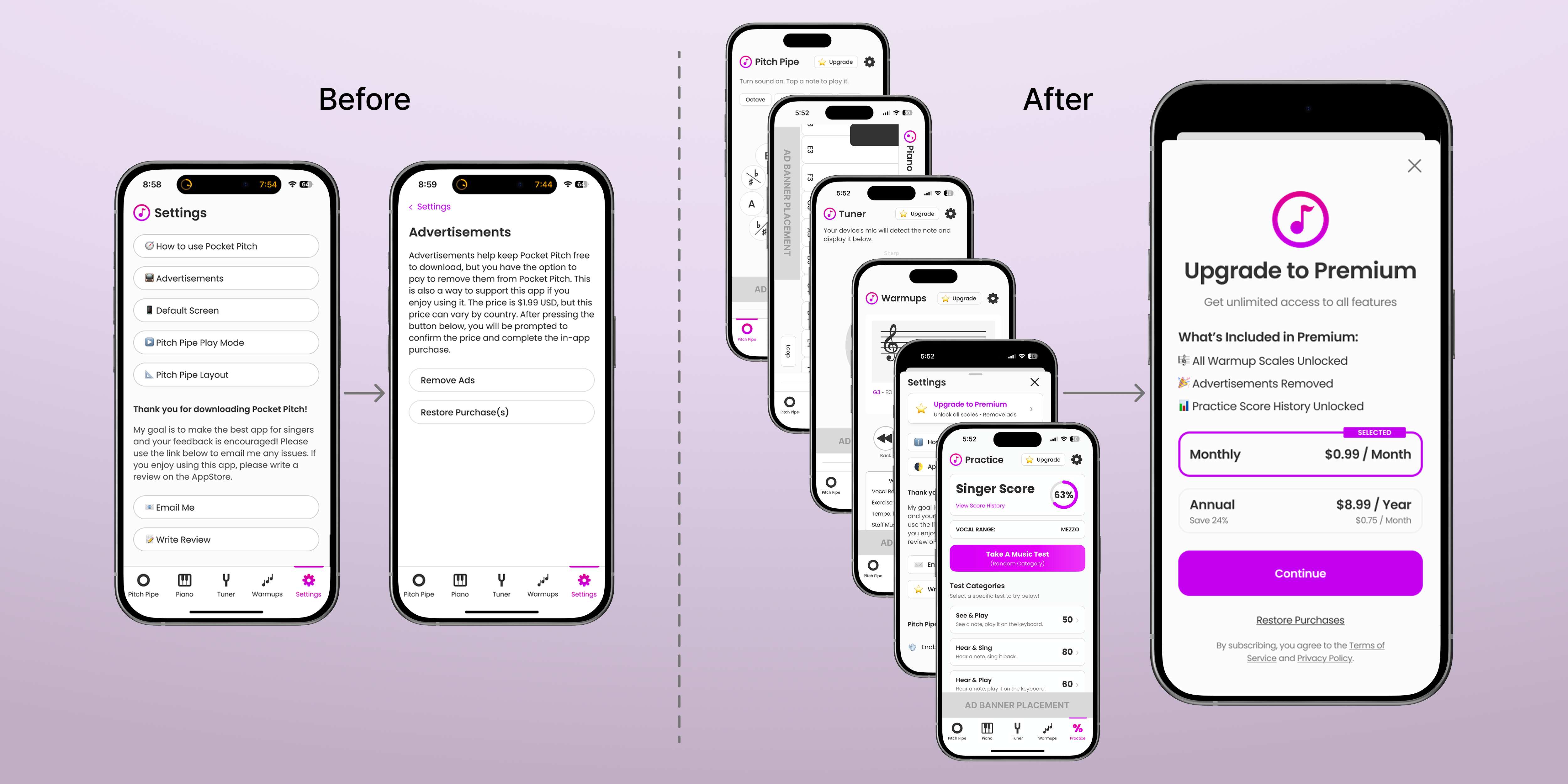
Left: Old path to user purchase via settings. Right: New premium paywall accessible throughout app.
What Premium Unlocks
Increasing value for power users.
The new features attached to the launch of premium are vocal warmups and practice music tests. Both are offered free as limited versions with ads. With a premium subscription, users can unlock a long list of vocal scales for their warmups (like different exercises and machines at a gym), track their score history from practice music tests, and remove ads from all the core features of the app. Premium helps users be strong and better prepared for practice, rehearsals, and performances.
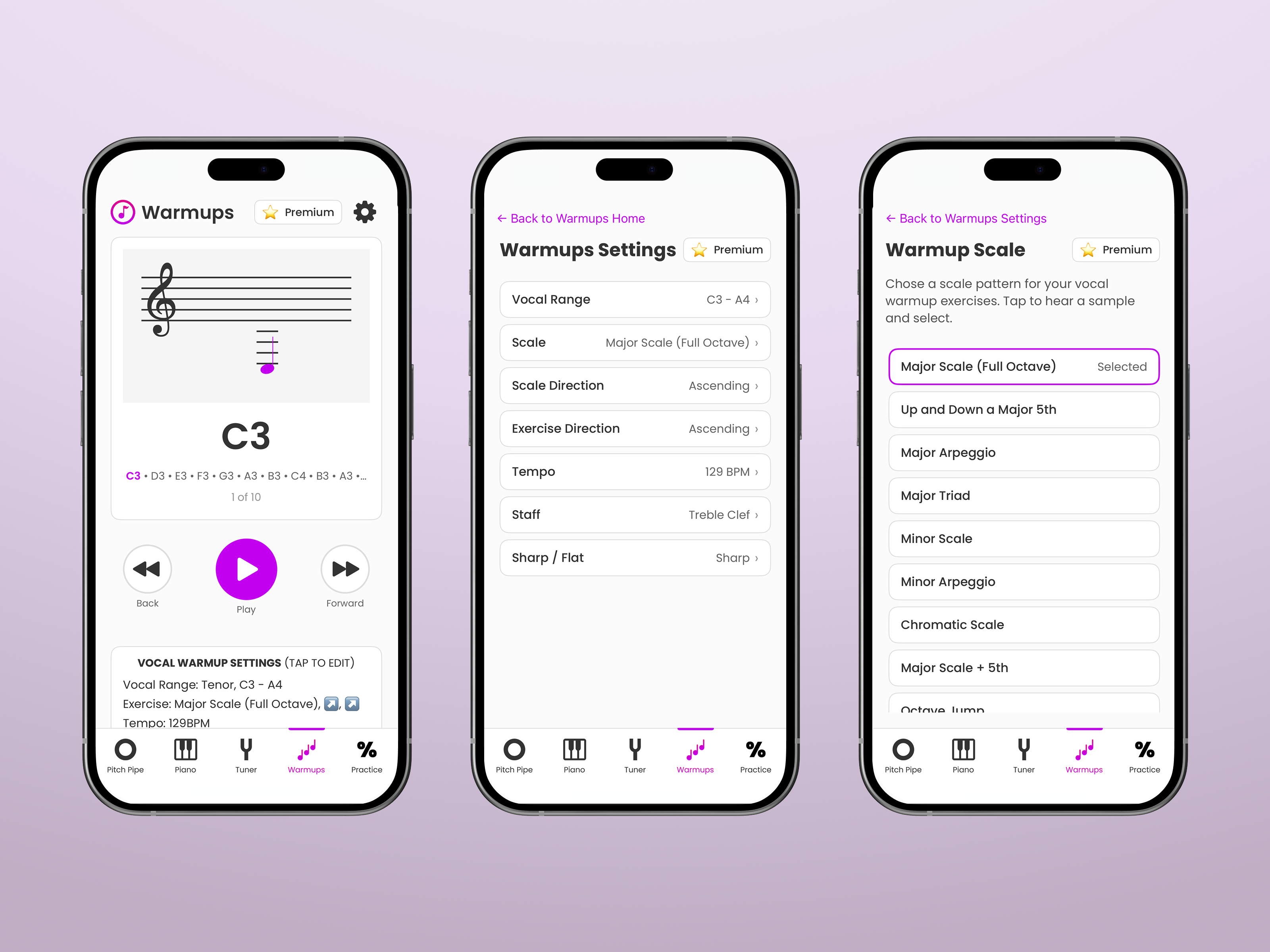
Vocal Warmups
Singers use vocal warmups to open up the full range and strength of their voice and prevent injury. Warmups are customizable based on vocal range, tempo, scale/exercise, and music visualization.
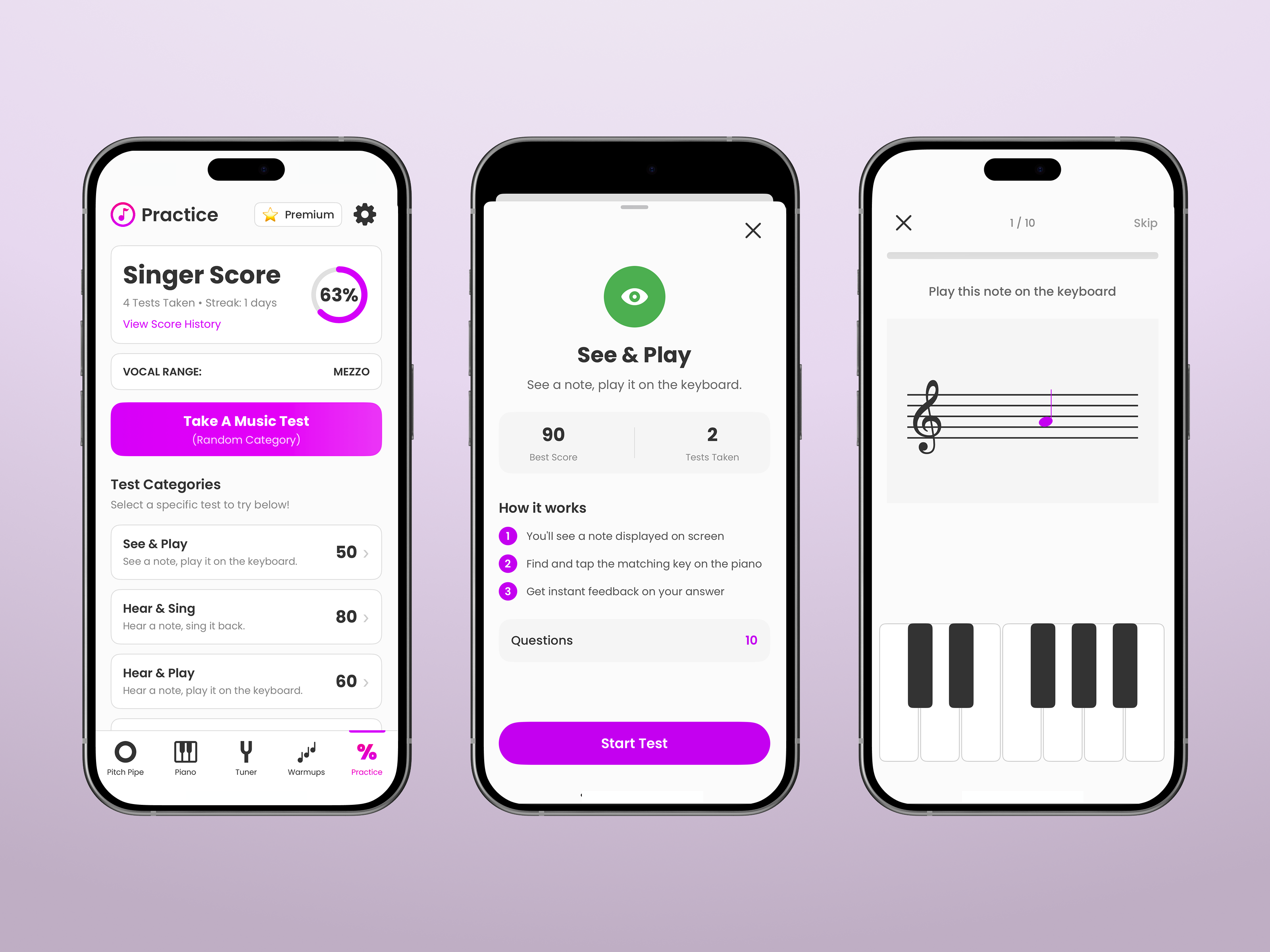
Practice Tests & Score History
Practice music tests allow singers to focus specifically on pitch accuracy and music notation knowledge; both crucial. Score history tracks the growth users want to achieve.
User Flows
Mapping the paths to premium.
Before designing any screens, I mapped out the user flows for how and when users would discover the premium subscription. The goal was to make it accessible from just about anywhere in the app. There were four types of discovery points: the onboarding screen, the upgrade/premium button callout on each feature, warmup scale's limited free selection, and practice score's blocked history. I wanted the flow to feel natural rather than pushy, so I laid out the discovery and payment steps to ensure users understood the value before being asked to pay. Ultimately I chose not to mention premium in the onboarding screen (because it felt too pushy) and instead I made sure onboarding mentioned the Warmup and Practice features that benefited the most from an upgrade to premium.
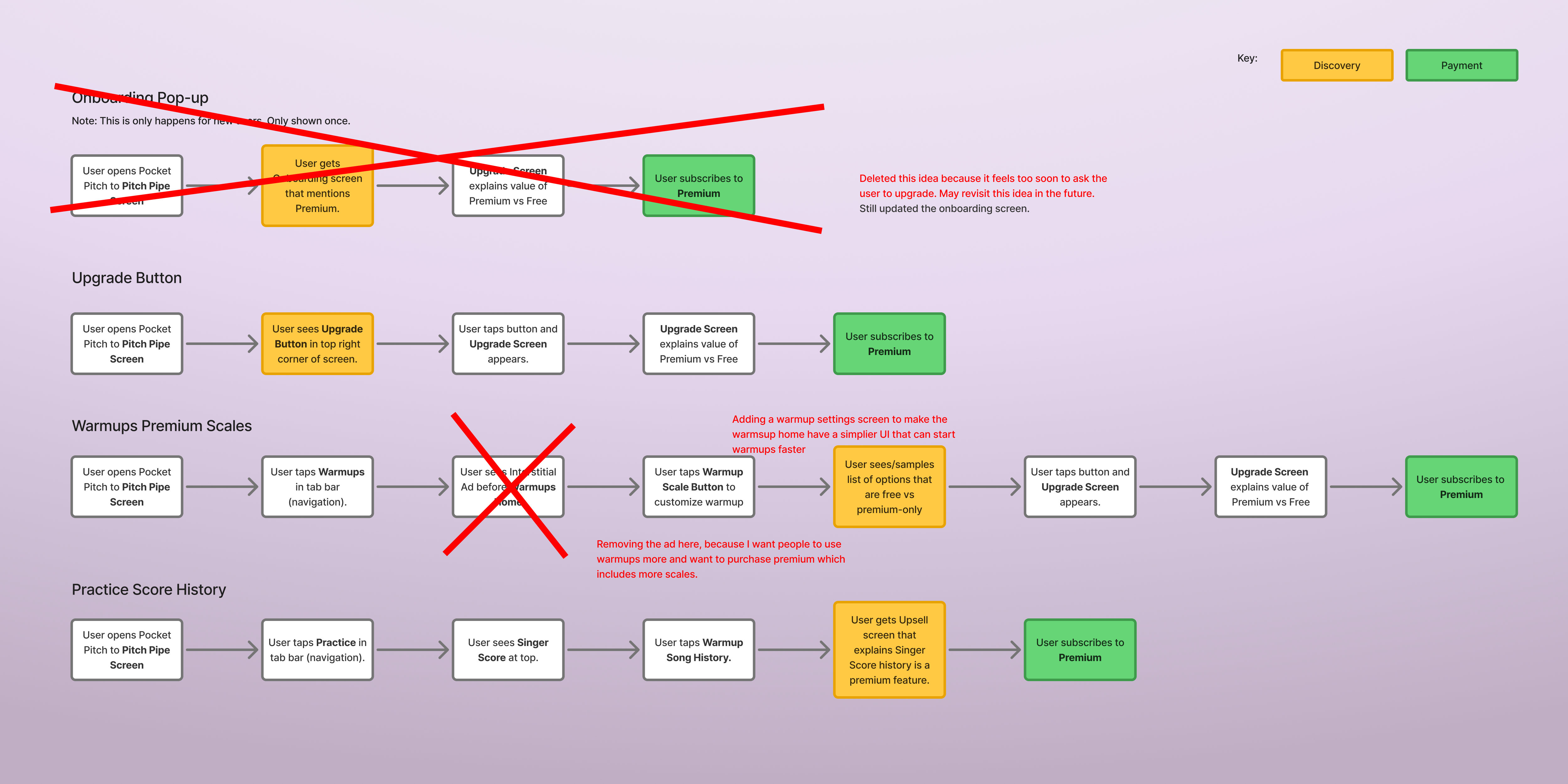
User flows highlighting discovery of premium and a successful upgrade.
UI Design
New elements with established styles.
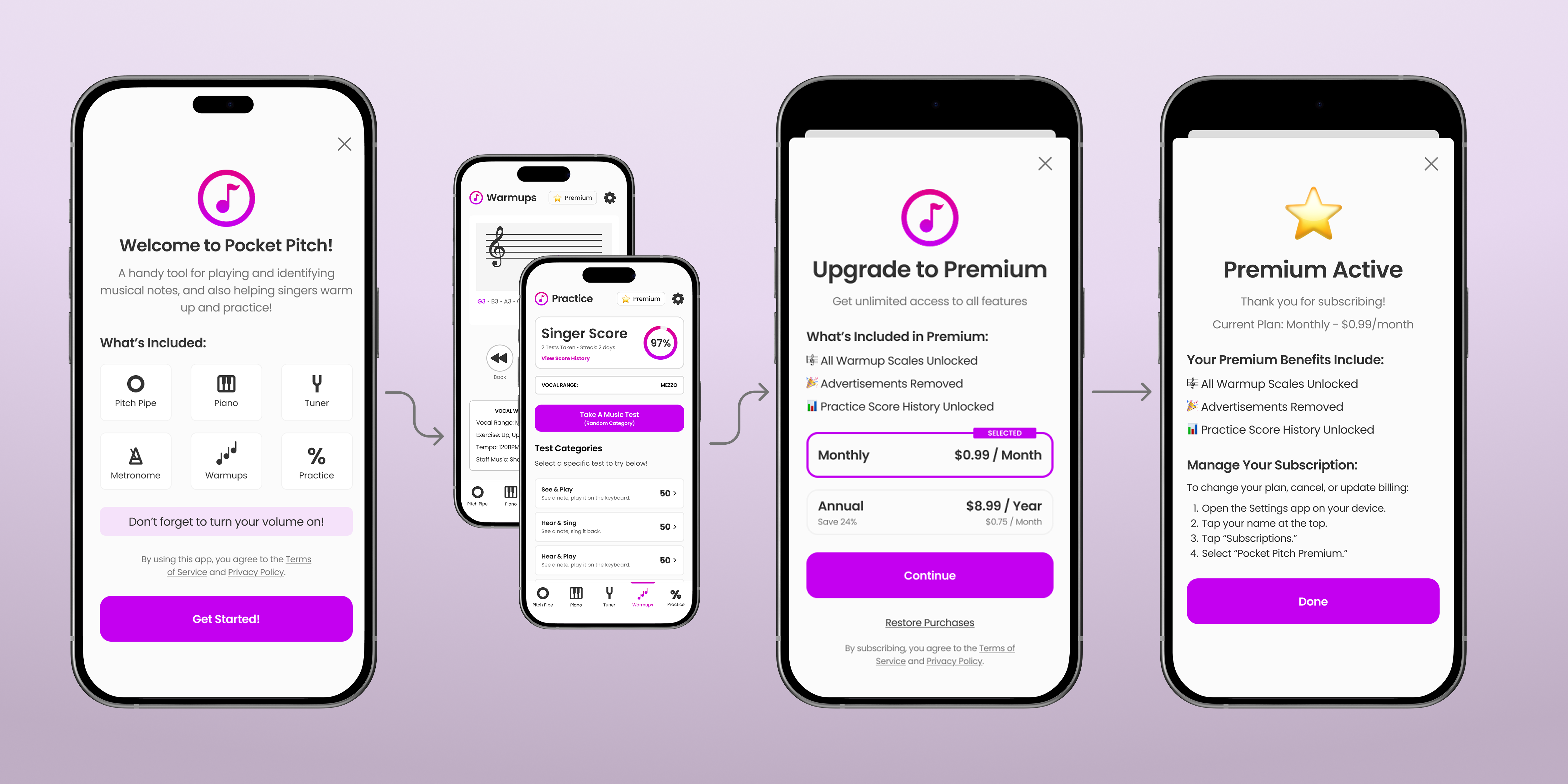
The new screens for the premium subscription started with a generic paywall layout that would be familiar to users based on what was common in mobile app experiences. From there I used established colors, fonts, and spacing styles to complete the UI design. Then I made the onboarding, premium active, and legacy active screens to match the look and feel of the paywall. Finally I made a "Upgrade" and "Premium" button based on the app's small button style, but adding a star emoji to grab attention (and hopefully more sales).
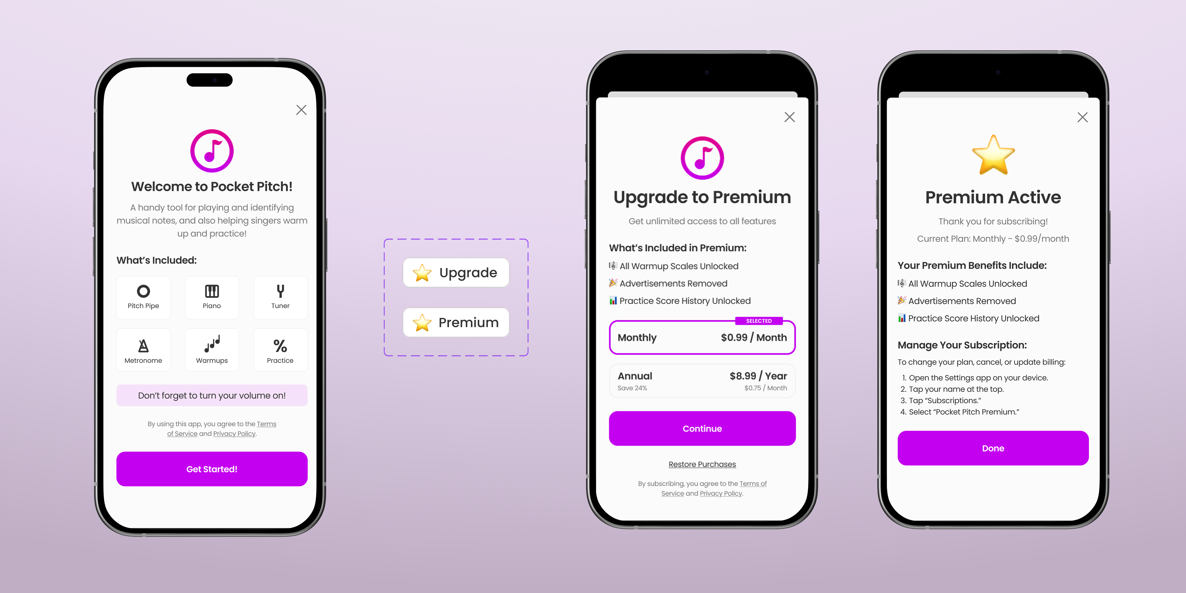
Onboarding, Upgrade/Premium Button (shown 2x larger), Premium Paywall, Premium Subscription Active.
Final Designs
All the new screens and elements in their flows.
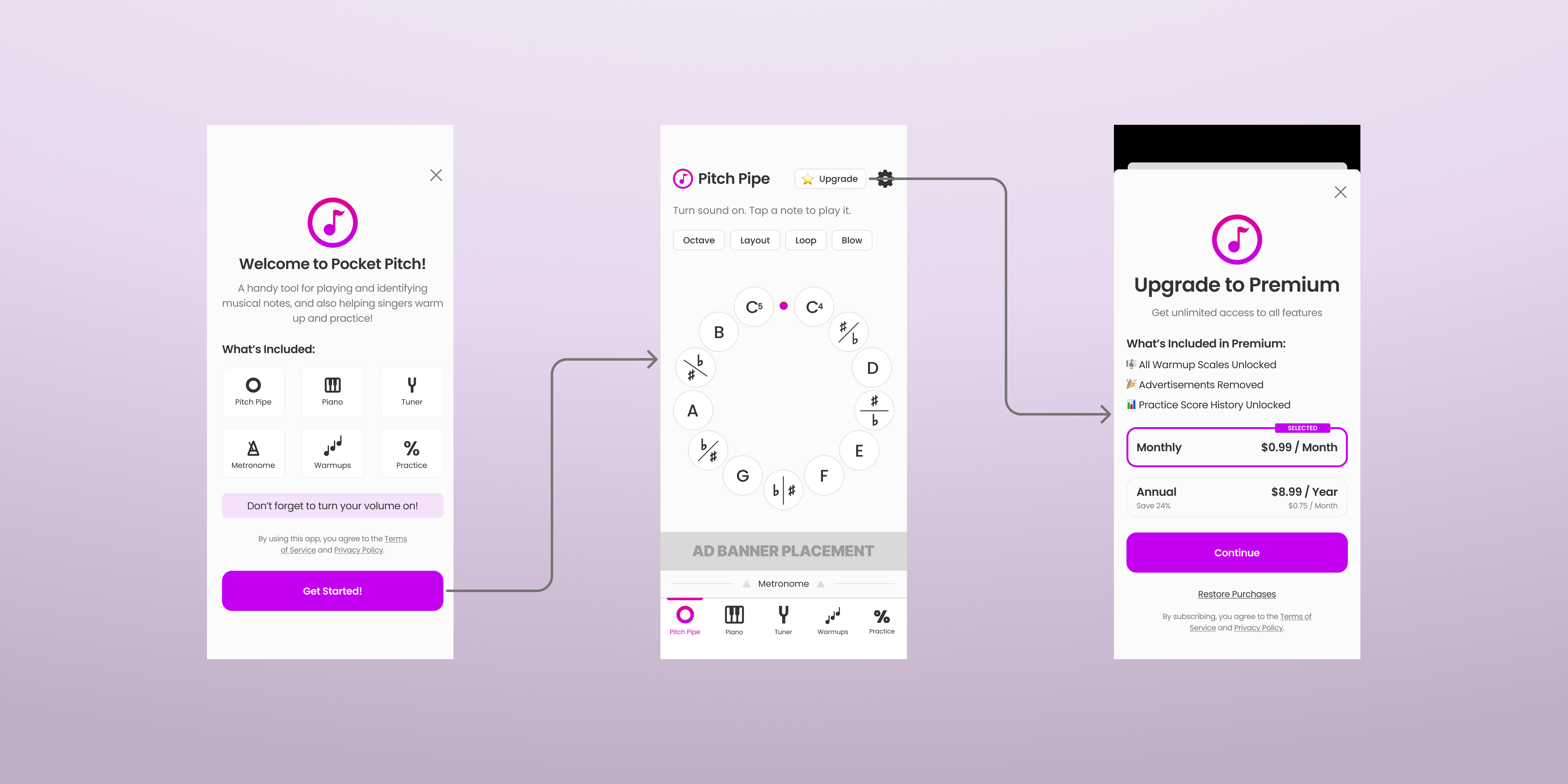
Final flow from onboarding to Pitch Pipe home screen to the Premium upgrade paywall.
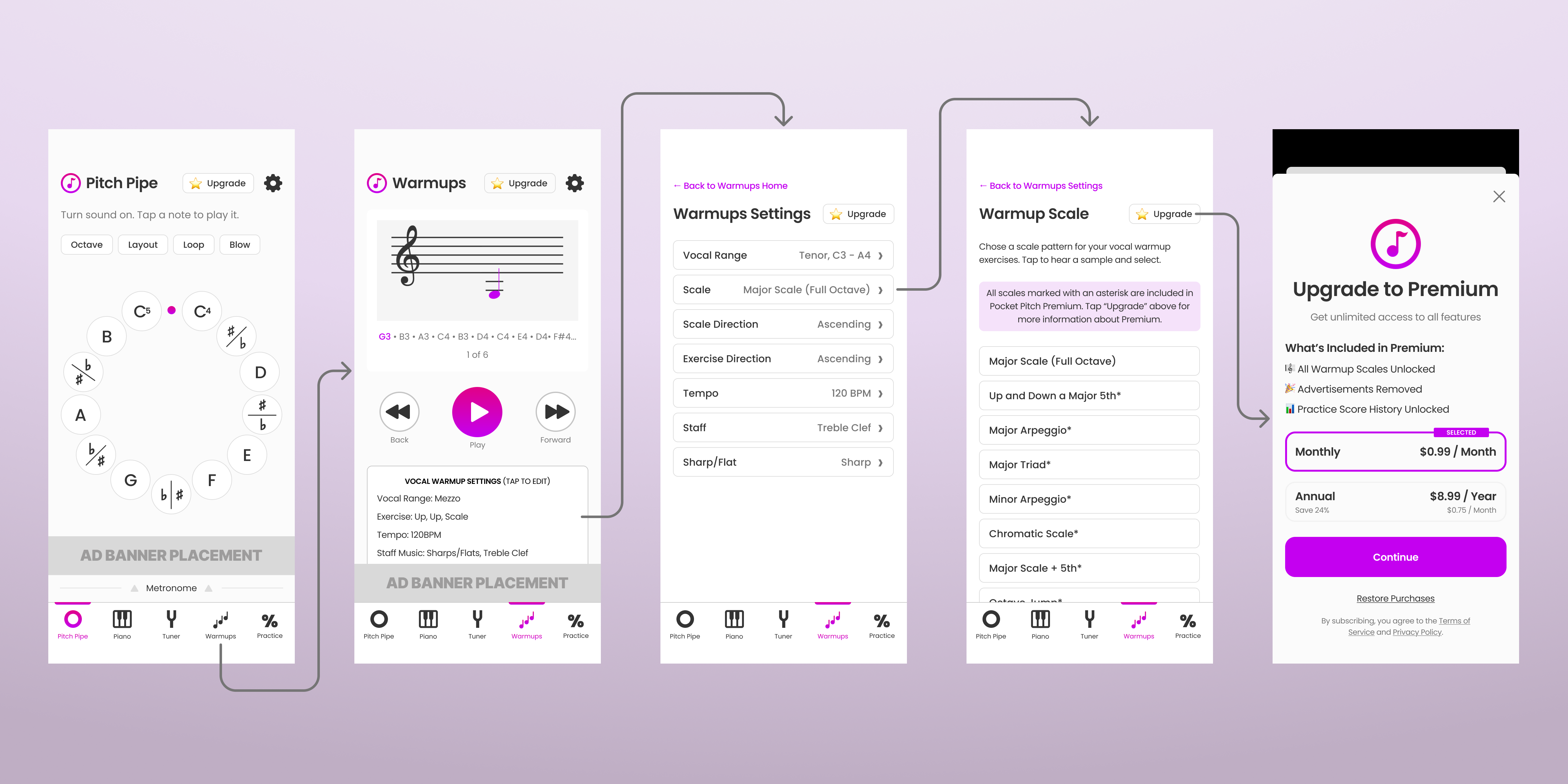
Full warmup flow from Pitch Pipe to Warmups, Settings, Scale selection (with premium-gated scales marked), to the Premium paywall.
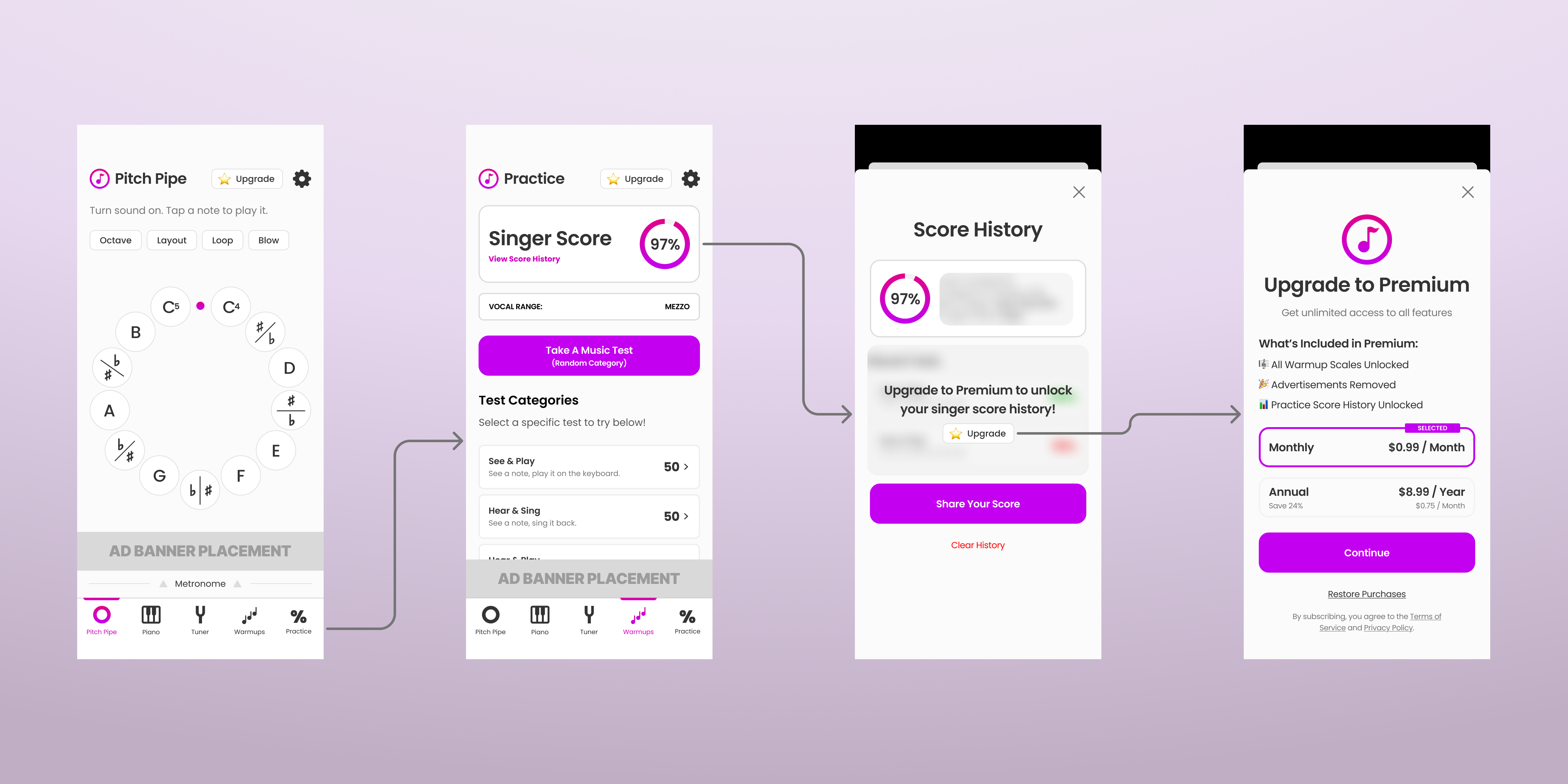
Practice flow from Pitch Pipe to Practice Tests, Score History (with premium gate on history), to the Premium paywall.
Reflection
What I learned.
This project taught me that monetization is about providing value and making the financial offer to users. Asking for payments (especially subscriptions) was intimidating for me, but I found my way forward by asking myself "how do I provide more than enough value to my users?" This shift allowed me to focus on the best Premium experience possible and turning the paywall into an opportunity to have more users experience it.
Always aim for a great user experience that helps them solve their core problem(s).
People will pay for products and features that provide value to them.
Introducing premium products and offerings can improve the experience for all users.
Next Case Study