Designing an MVP and building its scalable Design System.
As the first designer at inLoop, I designed the product UI for launch and built an accessible design system from scratch.
Role
First Designer
Team
First designer + technical founder
Timeline
2025
Company
inLoop
The Result
Design system built from scratch.
Designed the product UI and built an accessible design system as the first designer at inLoop. Every token, component, and pattern was an original decision with accessibility built in from day one.
WCAG AA
Accessibility
Built in from day one
First
Role
Every decision was original
The Product
A CRM for non-profit fundraising.
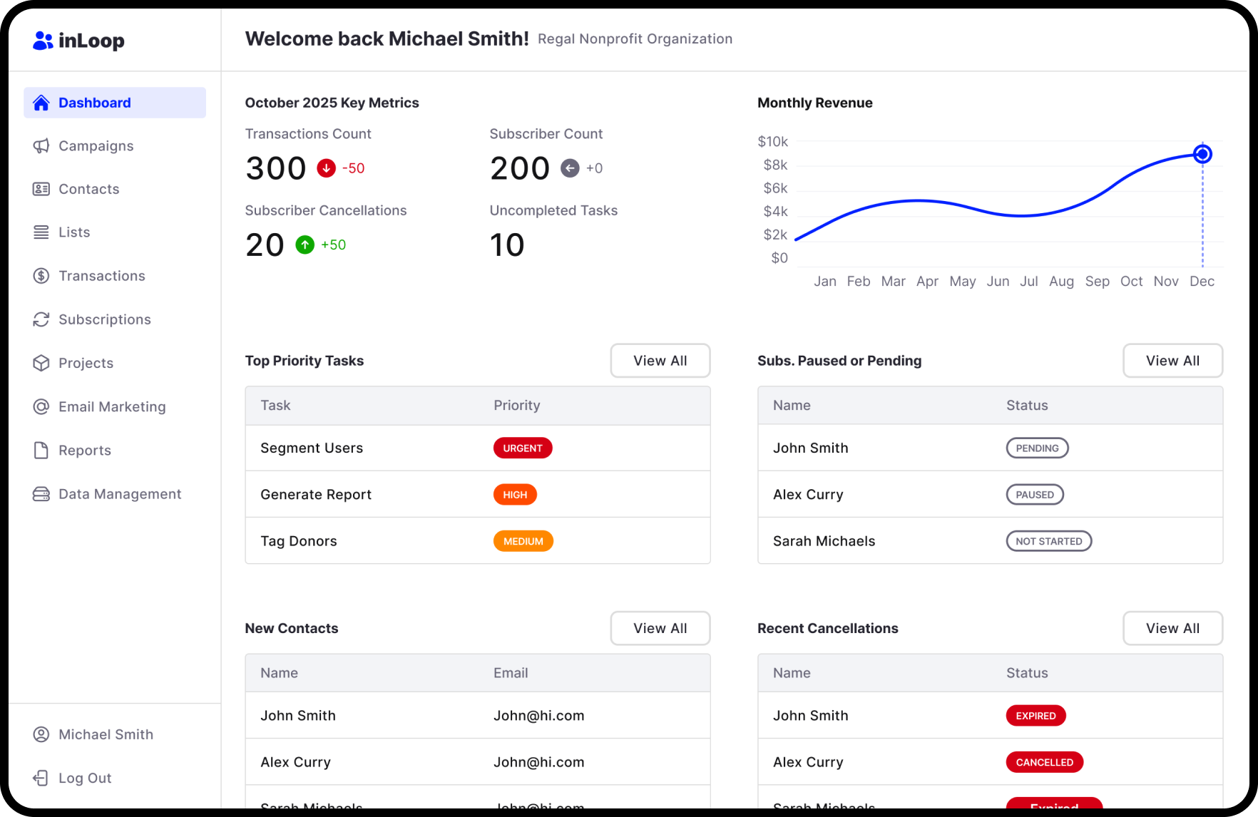
inLoop is a CRM built for non-profits to track their fundraising efforts. The technical founder had already built working functionality, but the product needed a modern UI designed around what existed. As the first designer, there was no design system, no component library, and no established patterns. I needed to design a product UI that worked with the existing functionality while building the system that would scale the product beyond launch.
Design Requirements:
- 1Create a modern UI for the MVP launch
- 2Create a scalable design system
- 3Follow WCAG accessibility standards
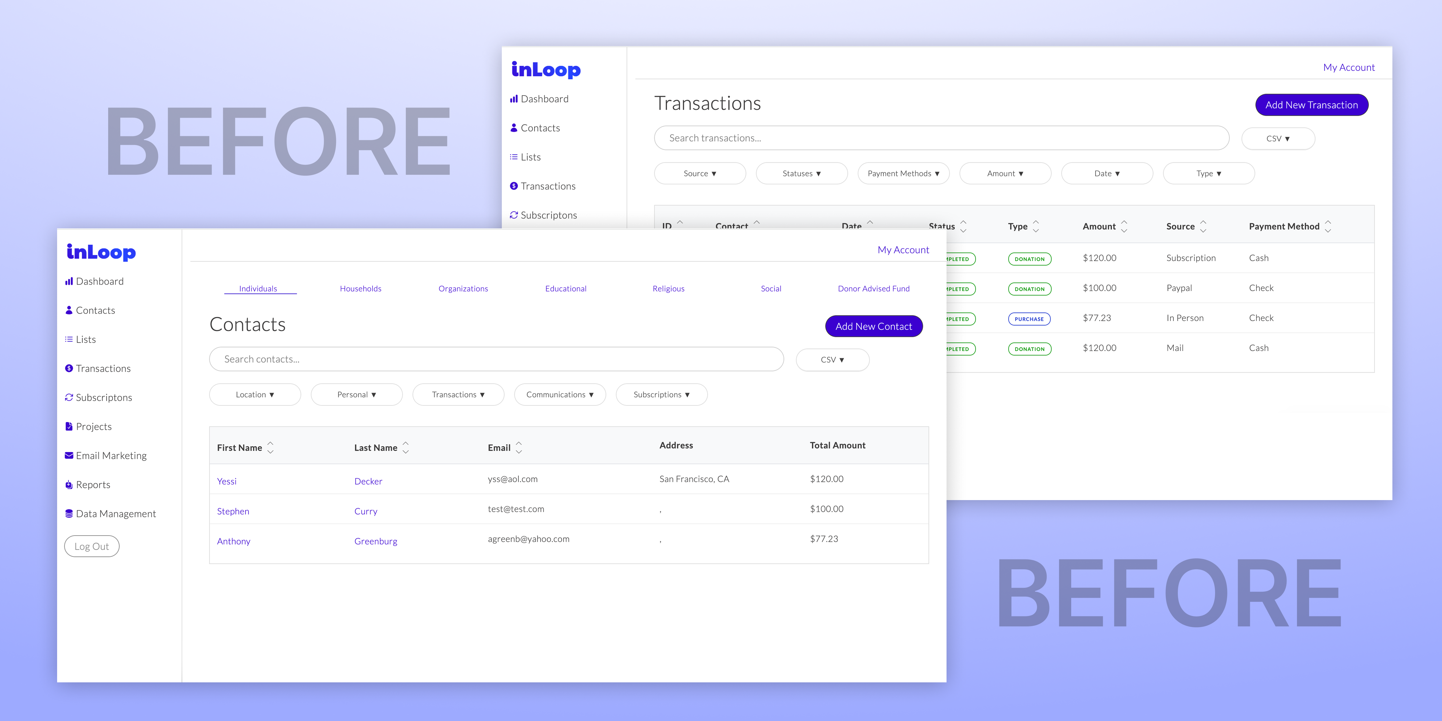
The technical founder's existing screens that I used as a starting point for the UI redesign.
UI Design
Designing the product screens for launch.
The technical founder had already built the core functionality, so my job was to design a modern UI around what existed. Working closely with him, I designed the core screens for the MVP: dashboard, contacts list, contact detail, and fundraising views. Each screen revealed which spacing values, color pairings, and component patterns would recur. The design system was extracted from real product needs, not theoretical ones.
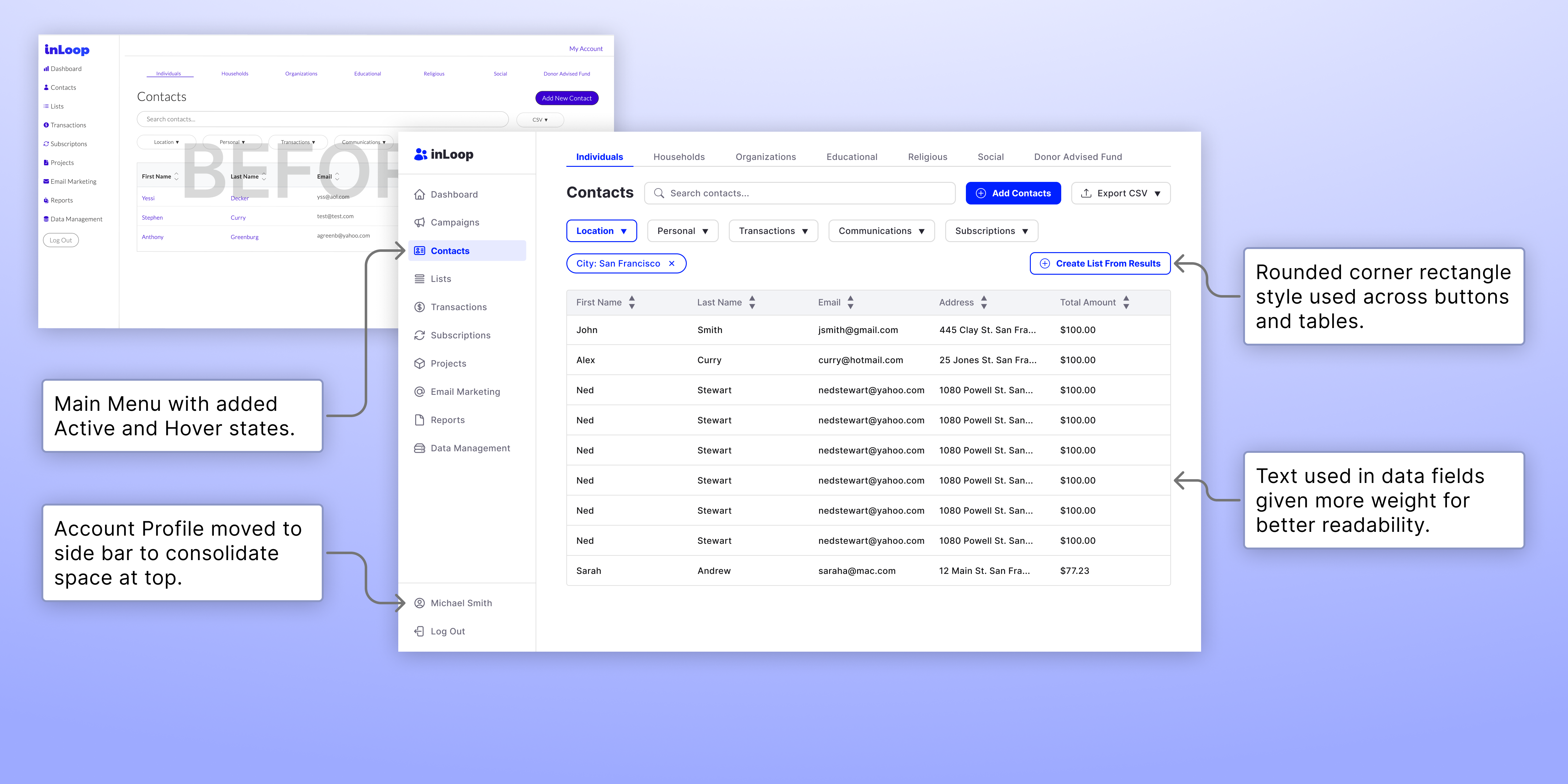
Contacts screen with highlighted design changes.
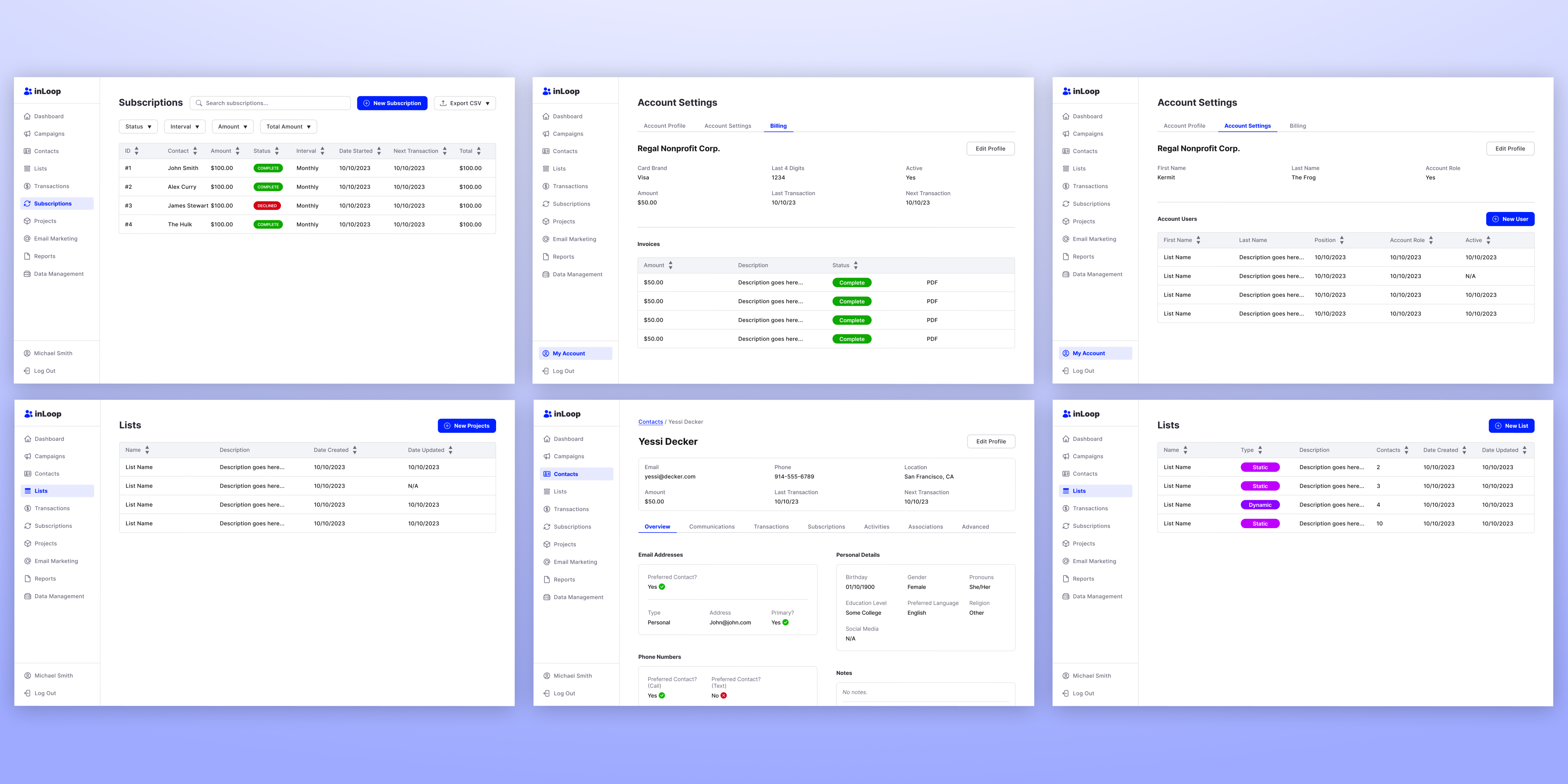
Assorted screens after updating the UI Design.
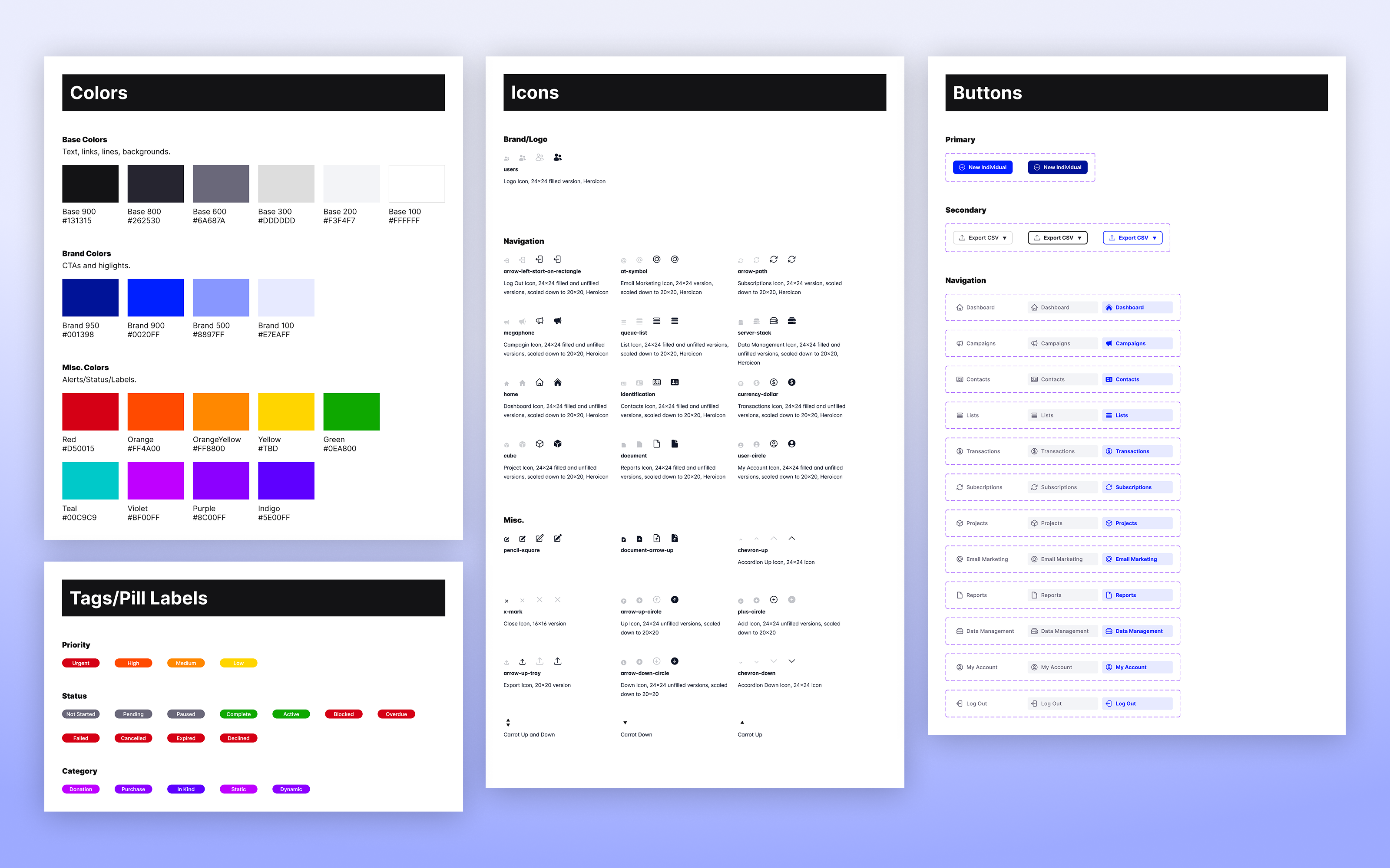
Design System
Extracting patterns into a scalable system.
Built a semantic color token system with explicit contrast ratio documentation. The system wasn't just accessible by coincidence. Accessibility shaped the entire token architecture: which colors could pair, which font sizes worked at which weights, and how interactive states communicated to all users.
Reflection
What I learned.
There is a lot of thought that goes into "simple" designs like grey tables with black text and white fill. This project forced me to focus on key principles of readability and accessibility.
Next Case Study