Designing a new feature with sight, sound, and touch.
A user request that inspired a multi-sensory feature with technical challenges.
Role
Solo Founder & Designer
Team
Solo (design, development)
Timeline
2026
Company
Pocket Pitch
The Result
Metronome for singers.
Designed, built, and shipped a metronome for singers who were already using multiple features within an app.
The Starting Point
Users kept asking for the same thing.
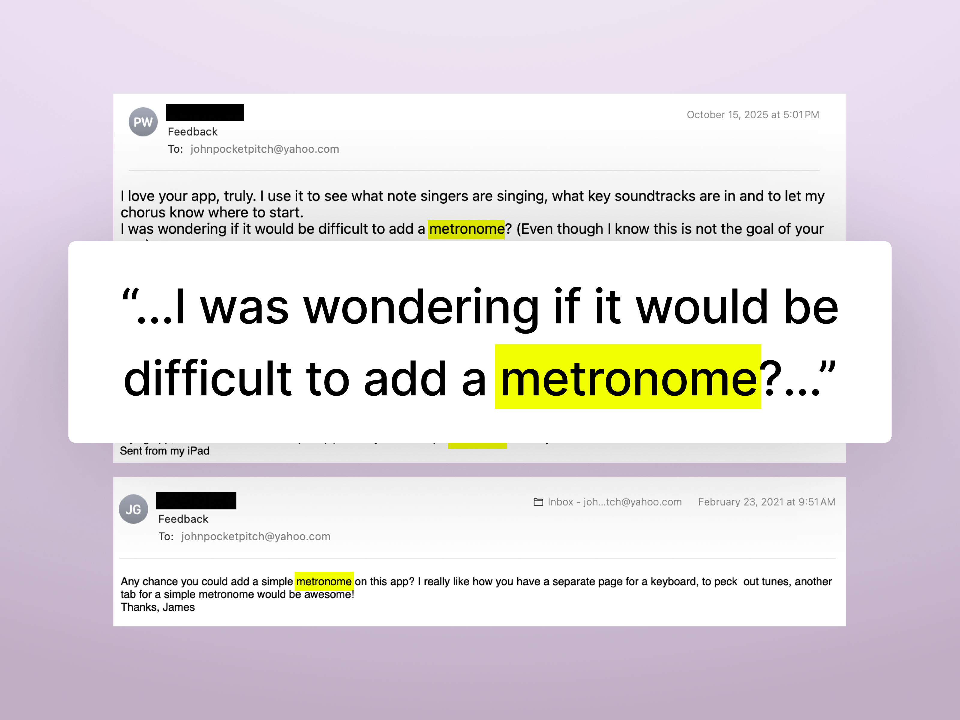
Email Feedback
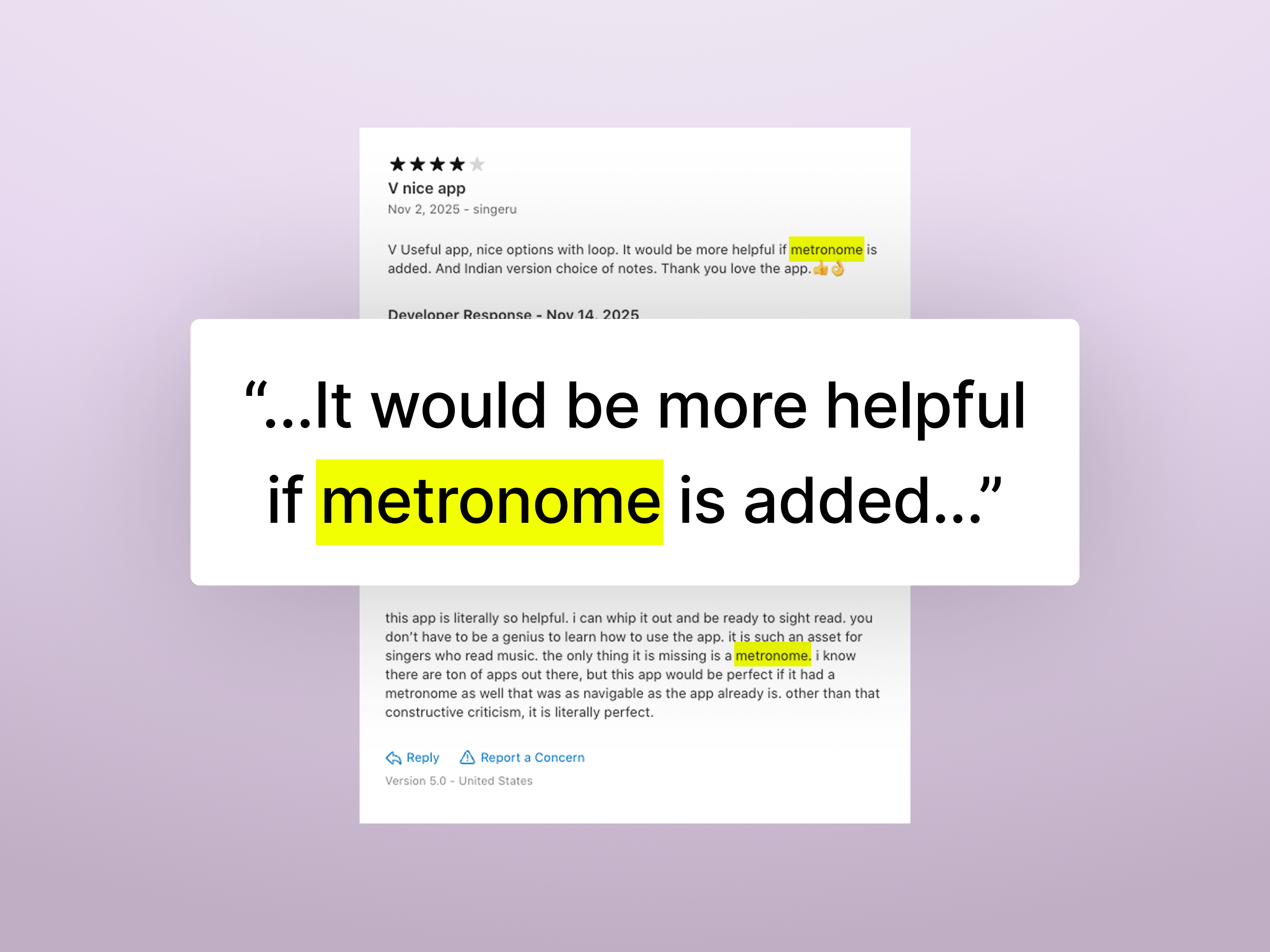
App Store Reviews
The Scope
Understanding the feature requirements.
Most musicians (including singers) cannot produce a specific tempo without a point of reference, like a metronome, so musicians use it when a specific tempo is needed to ensure accuracy. A metronome is a device that produces a steady beat (sound, light, or vibration) at a set tempo (usually defined as beats per minute). This new feature needed to add the functionality of a metronome while seamlessly integrating into the current user experience.
Design Requirements
- 1Metronome must be available across all features where a user may get value from it (Pitch Pipe, Piano, etc.)
- 2Users need to control the tempo as Beats Per Minute
- 3Metronome must provide audio, visual, and haptic feedback channels that can be toggled independently
- 4UI must follow existing Pocket Pitch design patterns as much as possible
- 5Metronome should be as intuitive and obvious to operate as possible so no users are confused
Brainstorming UX
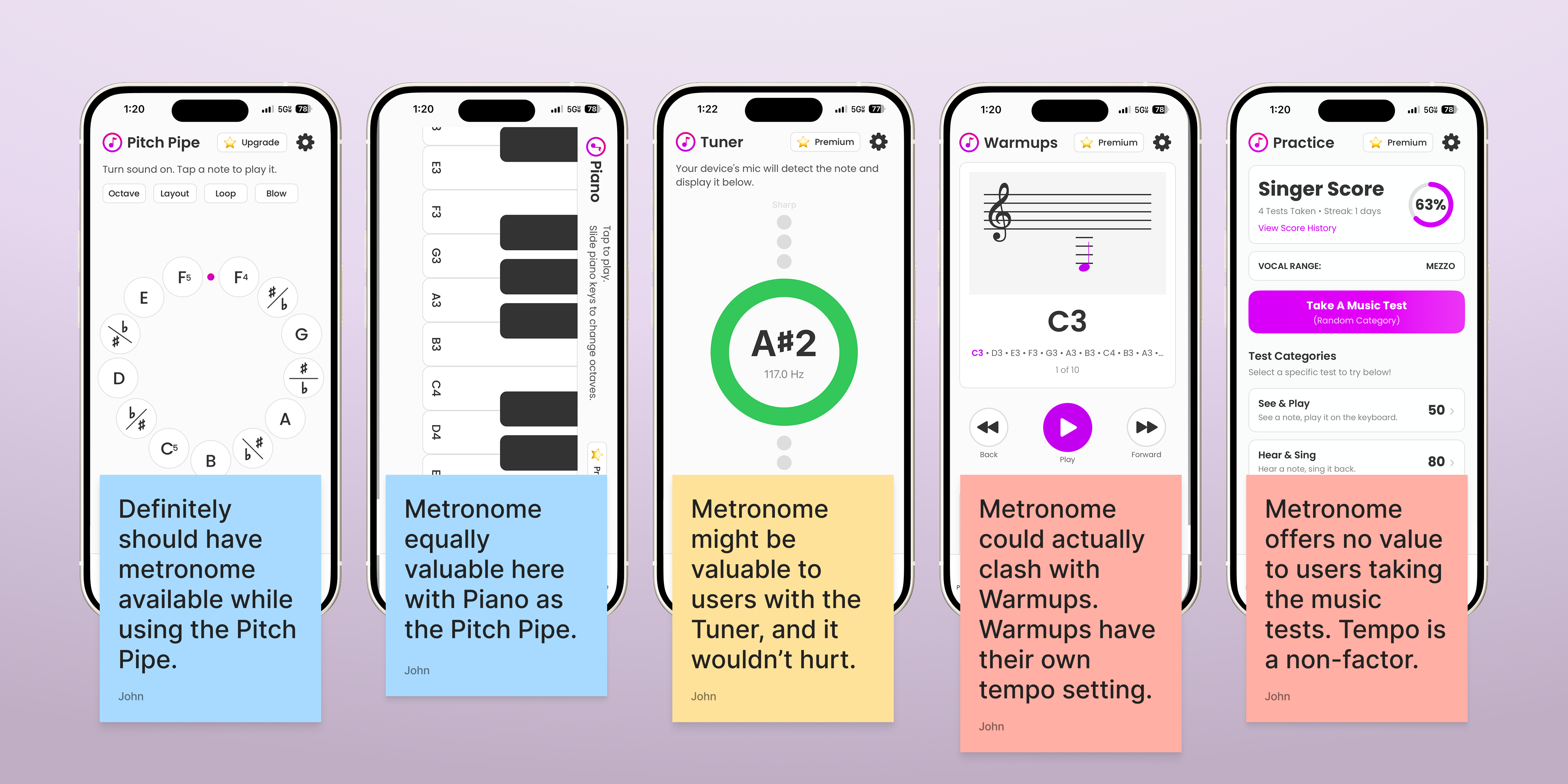
How does this fit in?
Where is a metronome needed?
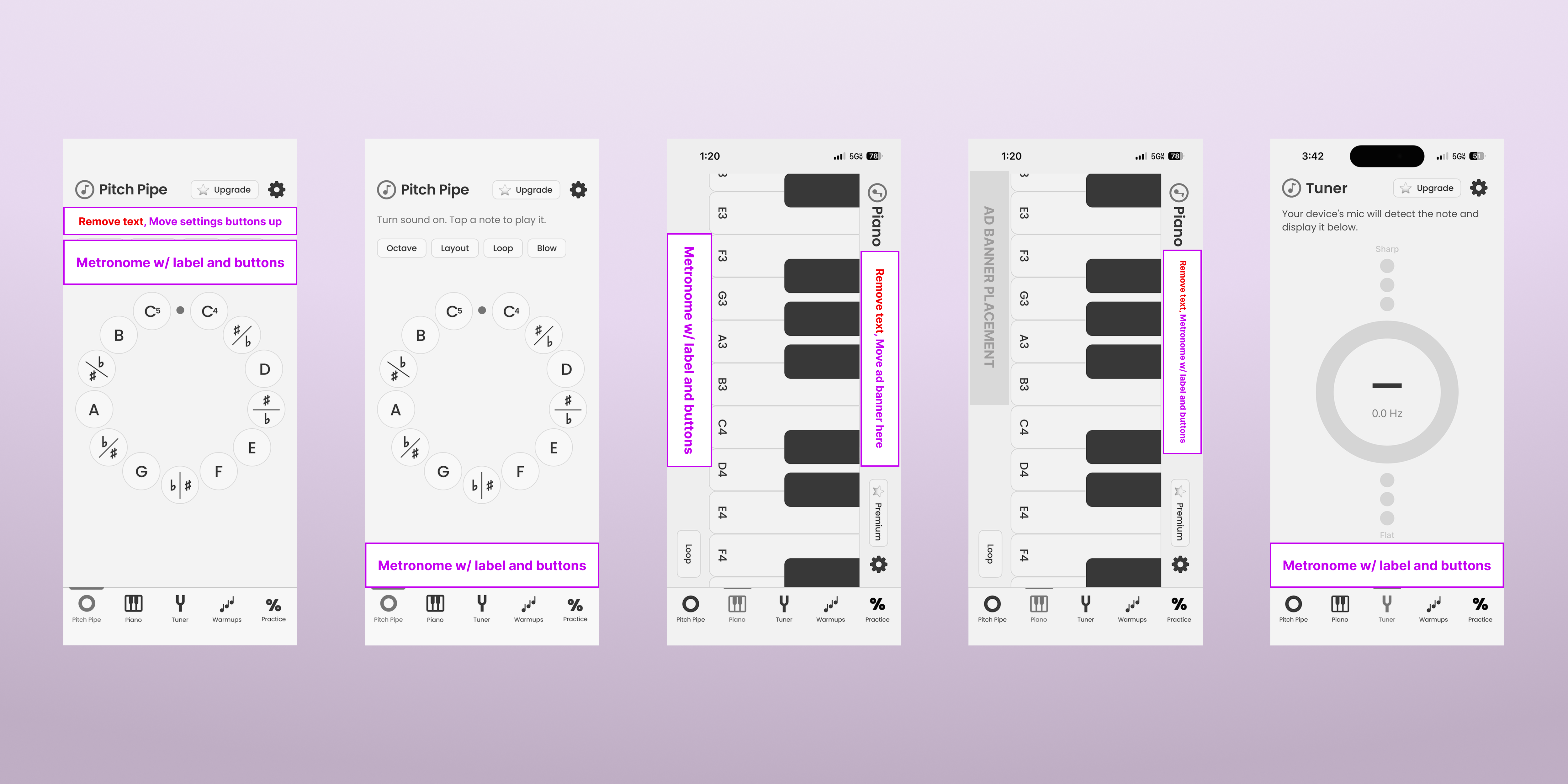
Pocket Pitch has five core features: Pitch Pipe, Piano, Tuner, Vocal Warmups and Practice Music Tests. These could be categorized into two groups: simple vs complex tools. The simple tools are almost like a Swiss-army knife and the metronome is a natural addition to that group. Because of this, it makes sense to integrate the metronome with the Pitch Pipe, Piano, and Tuner. Aside from that group of features, a metronome either would be redundant, lack any added value, or clash with the current structure of the Vocal Warmups or Practice Music Tests.
How does a metronome fit into the current experience?
I explored different approaches for integrating the metronome into the existing UI for the Pitch Pipe, Piano, and Tuner. There were some options, but I was bothered that there wasn't a solution that was consistent across all screens. What if a user wanted to run the metronome and actively switch between the pitch pipe and piano or tuner?
Key Decisions
From concept to interaction pattern.
Designing a global solution.
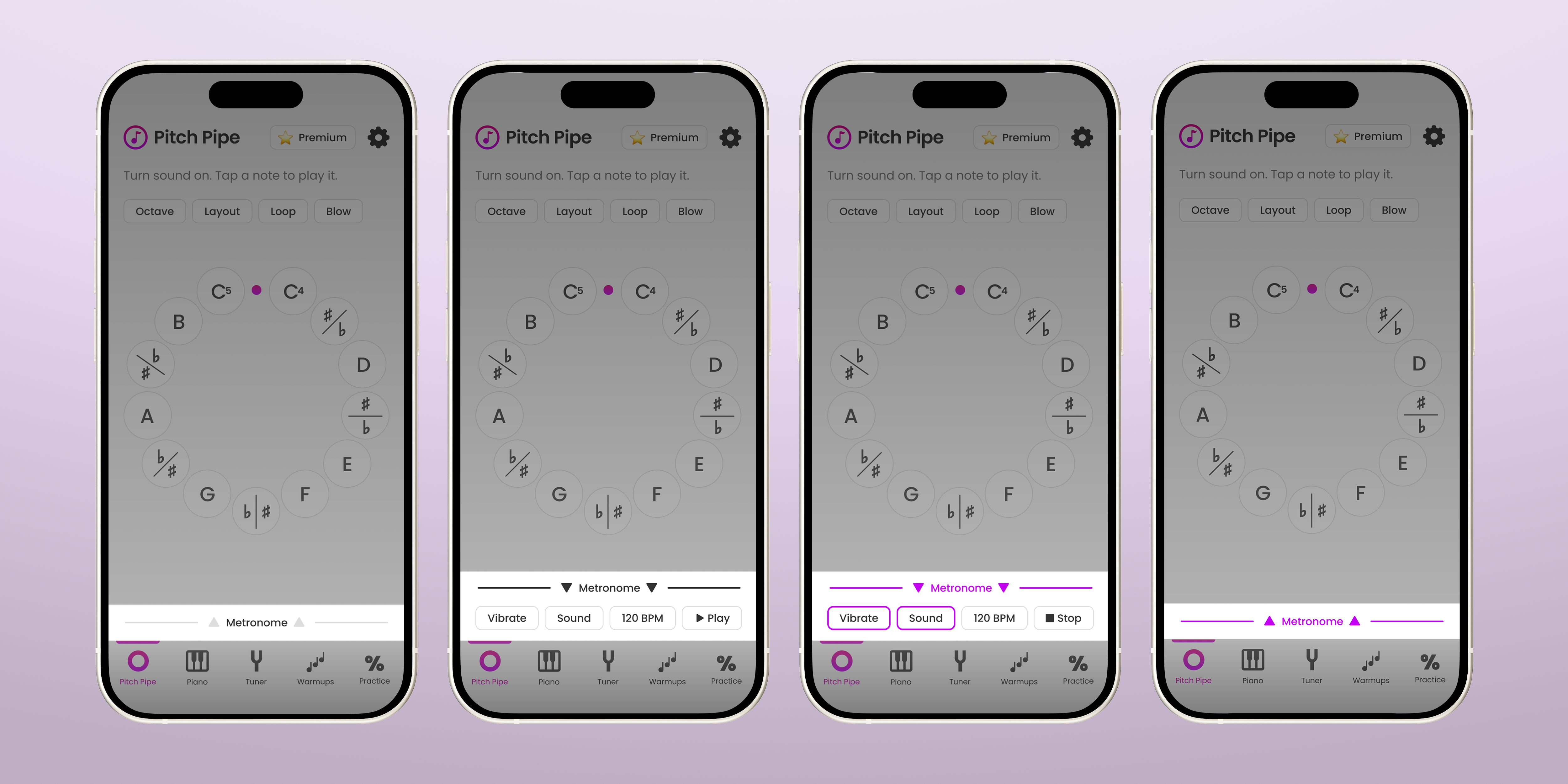
Because I work directly with the code for Pocket Pitch, I know how the files and code are structured. I knew that the tab bar's functionality and place in the code fit what I needed for the Metronome. Because of that, I had the Metronome follow suit. I also wanted to place the new global Metronome at the bottom of the screens because I had established a UX design pattern of placing local feature settings and messaging (like the Pitch Pipe) at the top.
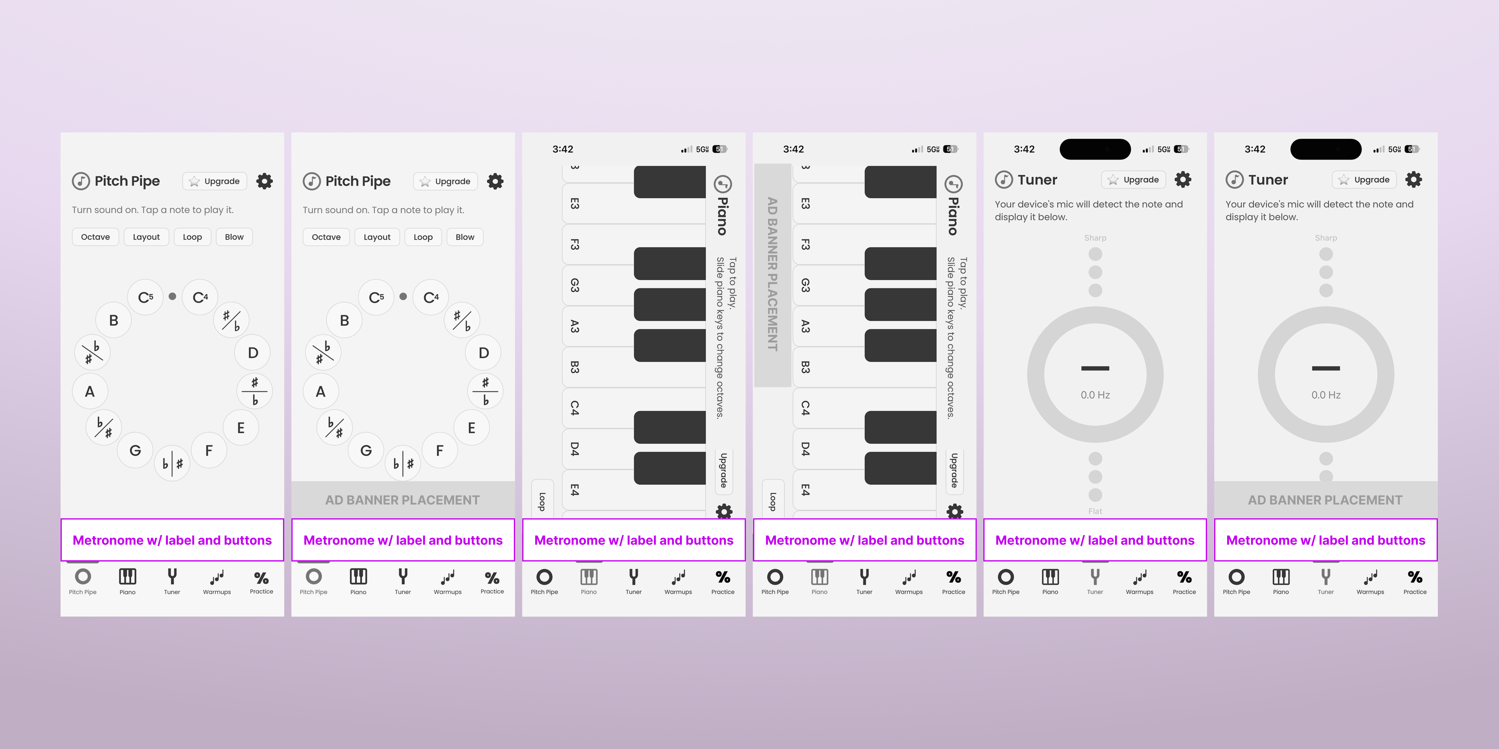
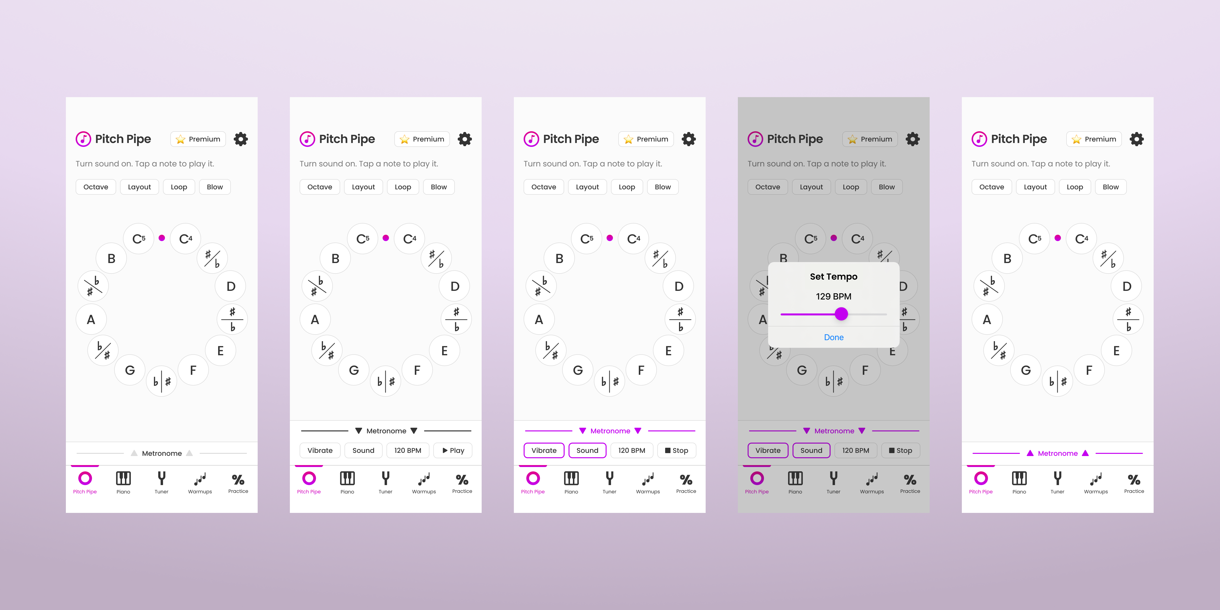
Proposed global metronome placement across Pitch Pipe, Piano, and Tuner screens (with and without ad banner for free users).
A drawer keeps it simple.
As soon as I started testing UI designs for the metronome, it felt like I was introducing too many new buttons onto the screen. Also, it was taking up a good amount of real estate regardless if the user was actually using the metronome. I wanted to try having the minimum amount of space used with the minimum number of interactions, so I went with a 44px tall rectangle (almost like an extension of the tab bar) and 1 interaction to open the metronome settings. For the behavior of the interaction I decided to have a drawer that would slide out when the user tapped or swiped up on the Metronome. Tap and swipe were already established interactions for the app. For the buttons of the metronome, I used the already established style used for the pitch pipe's settings buttons.
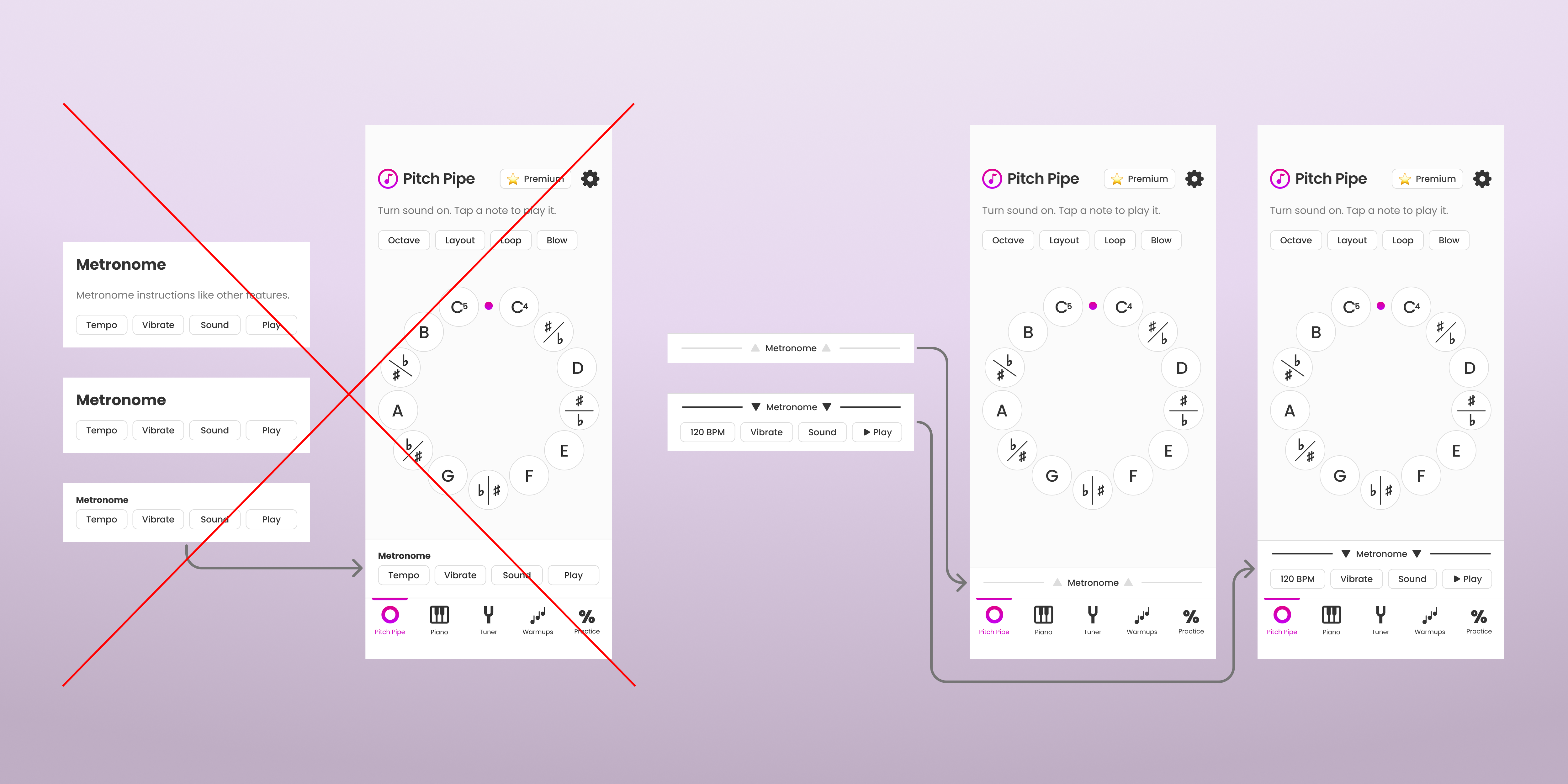
Static variations and the eventual drawer style.
Rapid Prototyping Testing
From ideas to my phone in hours.
Once the concept was solidified, I used Claude and Xcode to rapidly build a working version I could test on my phone.
Final Designs
Adjusting and shipping the polished feature!
Testing had revealed that the haptic feedback for the metronome's vibration could not be used while the tuner was active. In order to keep the metronome's vibration for the rest of the experience and avoid confusing users, I made an explanative pop-up message for when users tried to use the vibration and tuner at the same time. Additionally, I rearranged the settings buttons so that the tempo and play/stop (likely the 2 most used buttons) were both on the right side together to allow for easier one-handed use (maybe the user needs to hold sheet music or a microphone in their other hand).
Metronome drawer states: collapsed, expanded, playing expanded, selecting tempo, and playing collapsed.
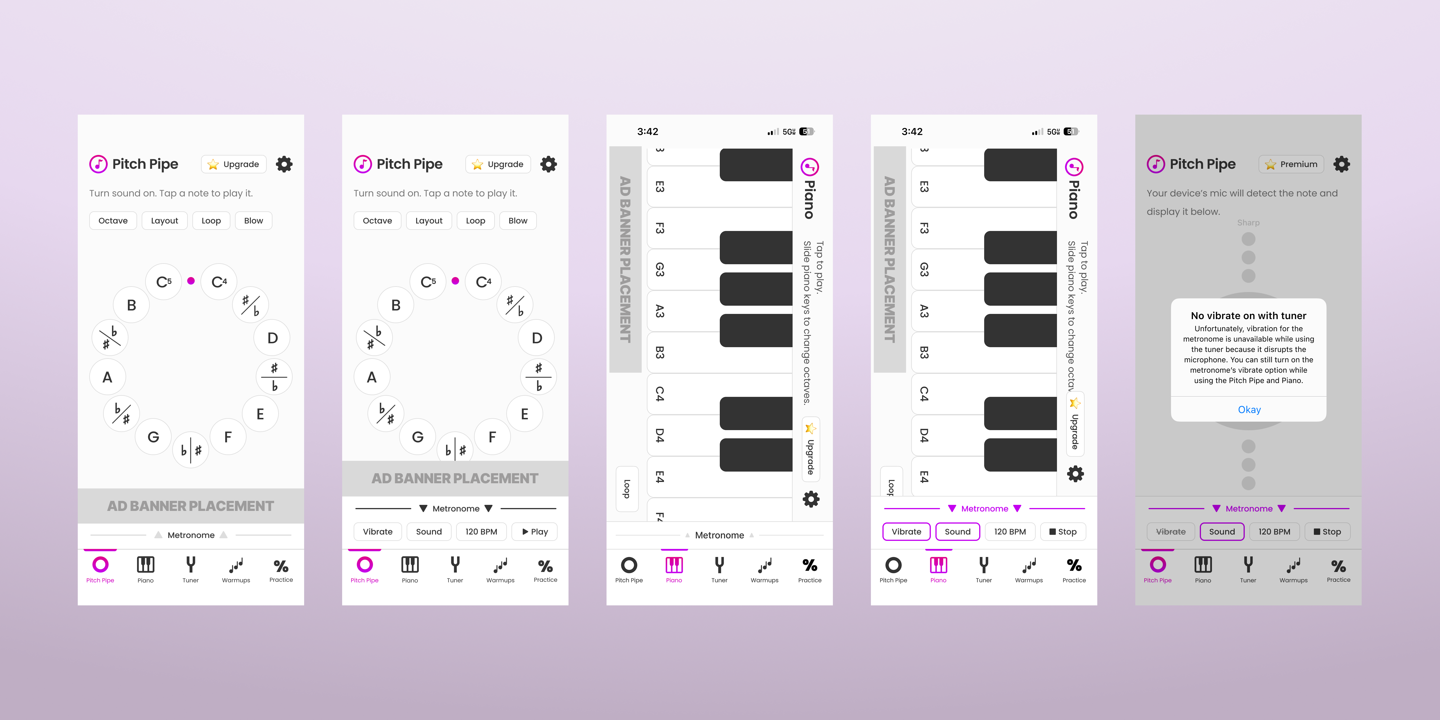
Metronome integrated across Pitch Pipe, Piano, and Tuner screens (with and without ads); plus the vibration conflict pop-up.
Reflection
What I learned.
What seemed like a simple feature actually brought technical and design challenges. Ultimately my technical knowledge and AI familiarity allowed me to come up with a path forward and ship a solution.
Design decisions go hand in hand with technical feasibility.
I can add value for users relatively quickly with AI tools.